Project 4: Index
Process Document
by Ecem Ozturk
Interactive Media:Web 501
OCAD Winter 2024
Part 1: Brainstorming
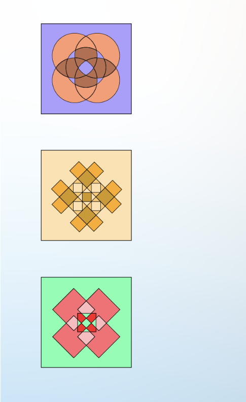
I have been spending a lot of time making things with my hands as a form of relatation for the past year. I have learned how to crochet and knit, and tried out making garnments from start to finish for the first time. For my "handmade" index page, I wanted to develop something that was inspired by such shapes, a primitive way of making color palettes and representations. Thus, my aim was to develop a graphic langauge based off on that simple look.
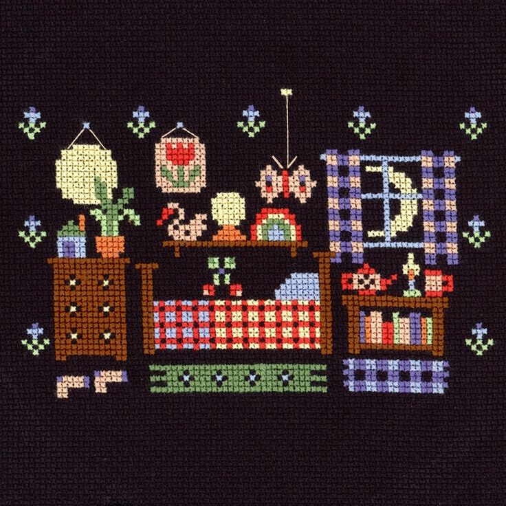
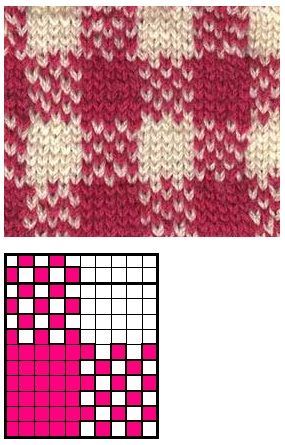
Pixel art is perhaps the immidiate thing that comes to mind when looked at such constructions of fabric. In fact, this is how you form a shape in cross-stitch too. You treat each loop as a pixel.
However, I wanted to make things a bit more interesting and complex. And I wanted the interaction to revolve around the shape, so there had to be a transition between the shapes.
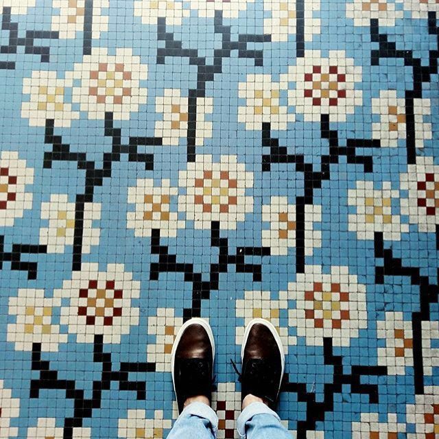
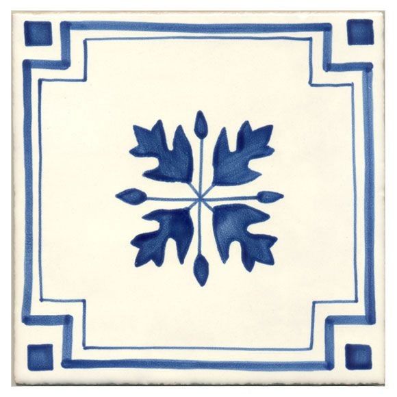
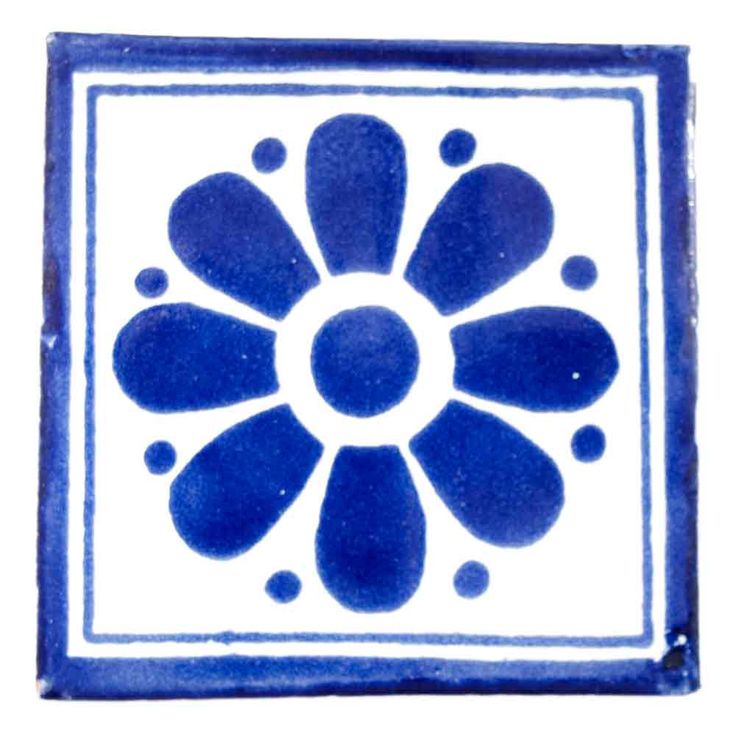
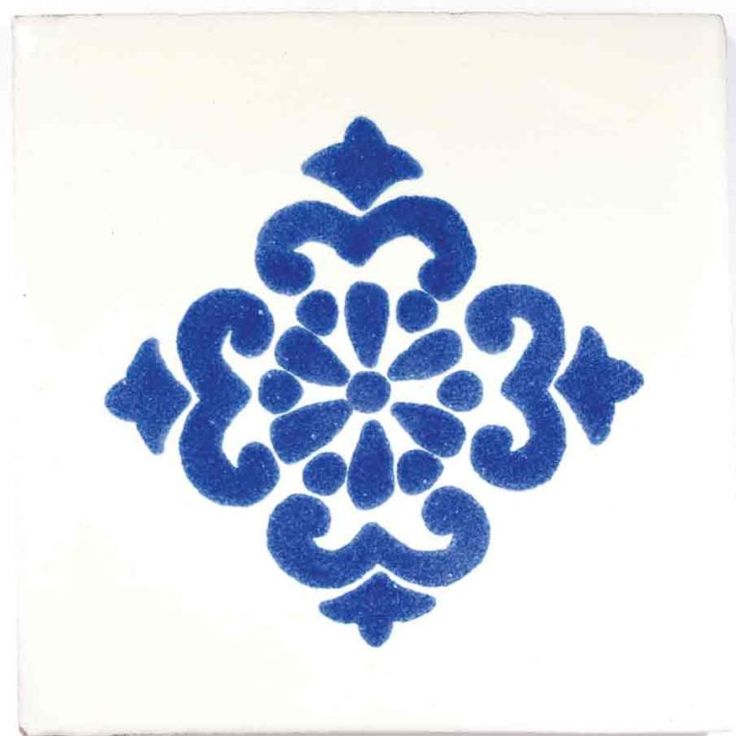
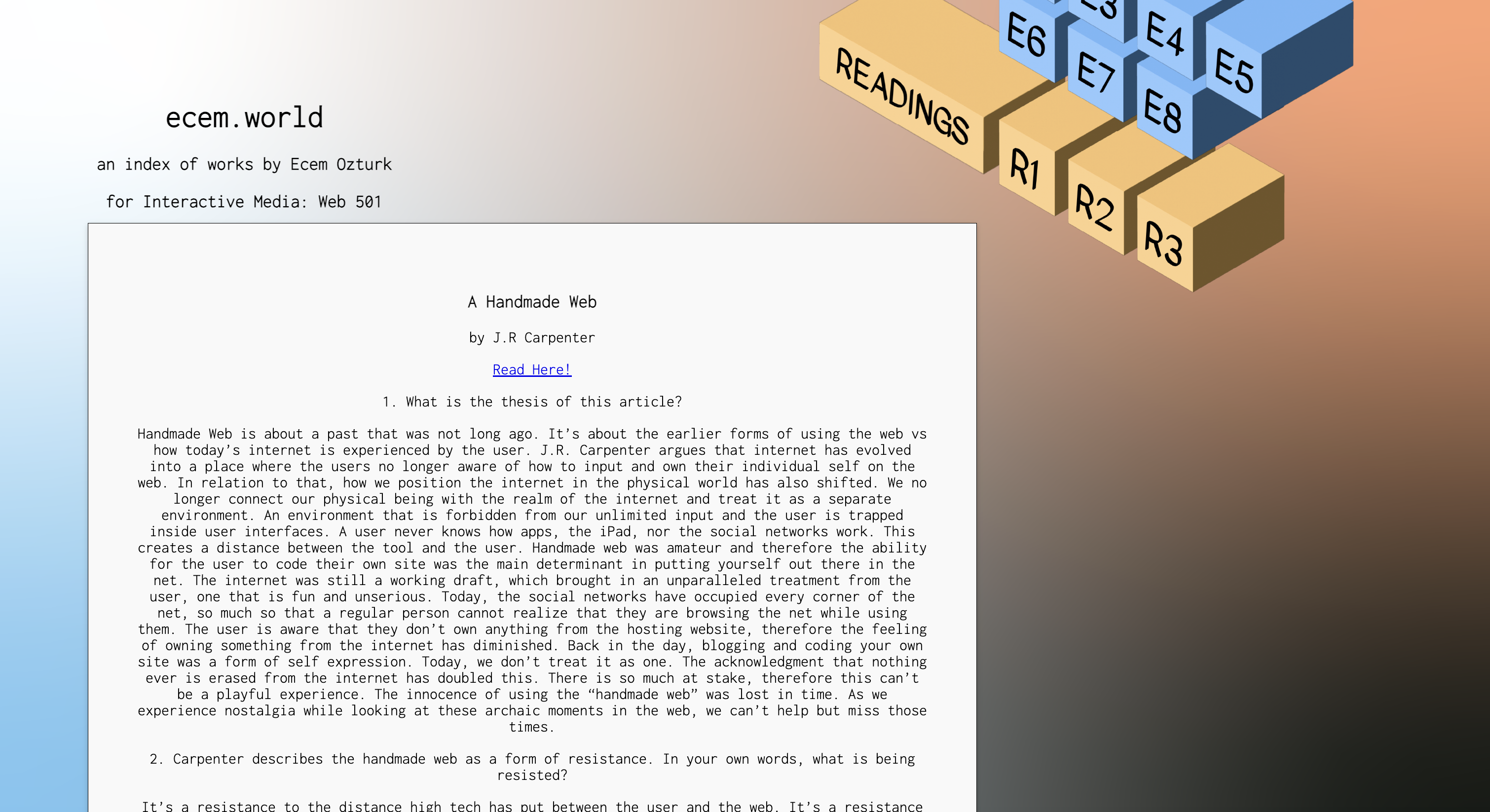
I arrived at 'tiles', as an inspiration to develop some buttons and logos for the index. Because tiles were too constructs of limited shapes, but they had more details inside that suggest representations and a visual language.
I was thinking perhaps transitioning from such a cultural object to a button or a logo, would make it as playful as I wanted it to be. With the same construction principles in mind, I designed tiles of my own.
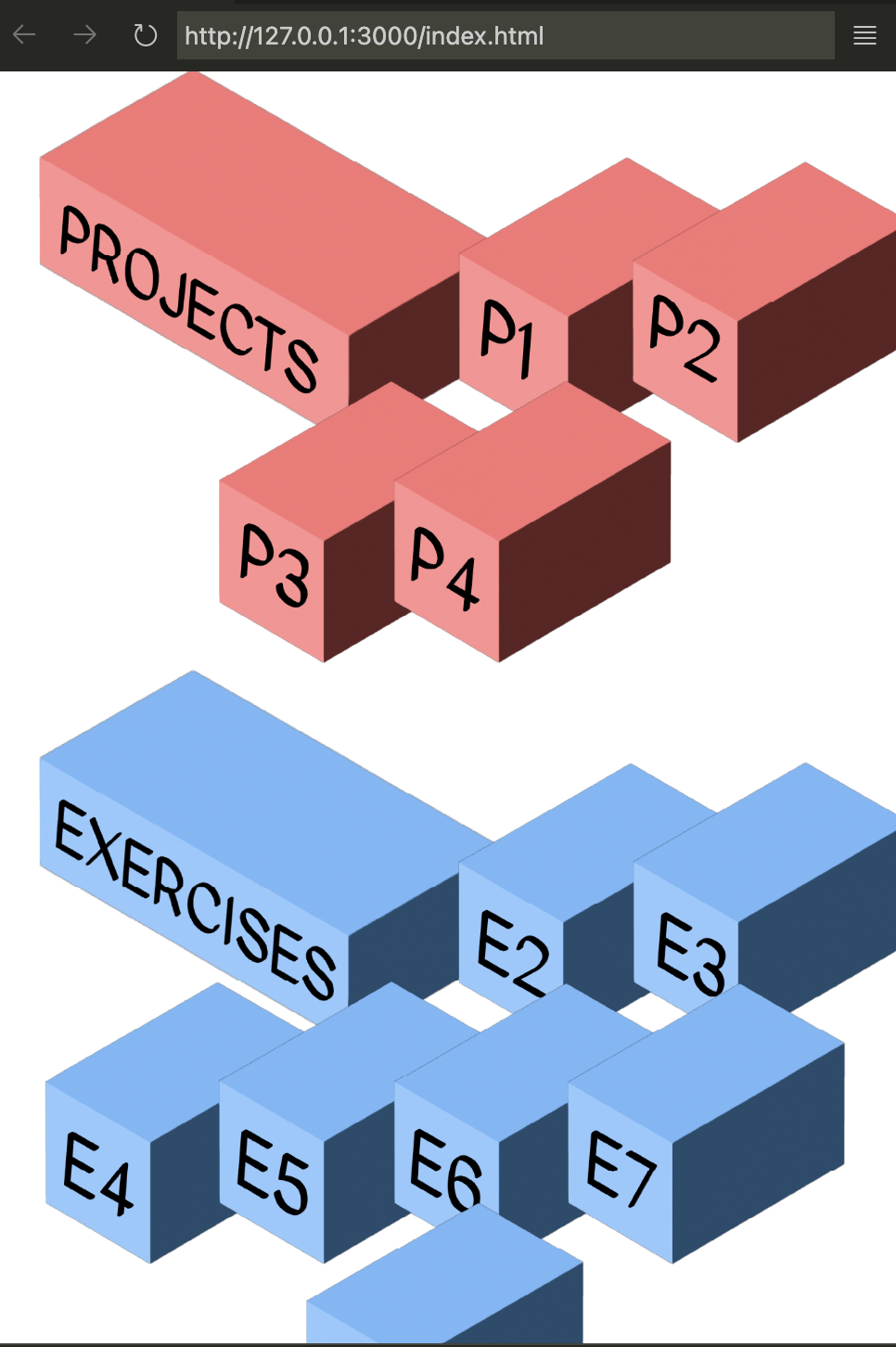
After this initial part of arriving at tiles and the square as a mode of construction, I was now thinking of making it 3D and transforming the 'space' which is the index a 3D environment.
3D squares have been the construction piece of many early 90s objects. It is still a very recognisable with Minecraft and Roblox being the most popular games among children and early-teens. Pixels and cubes are here to stay as cultural objects. They are easy executed pieces of bodies that make up familiar shapes.
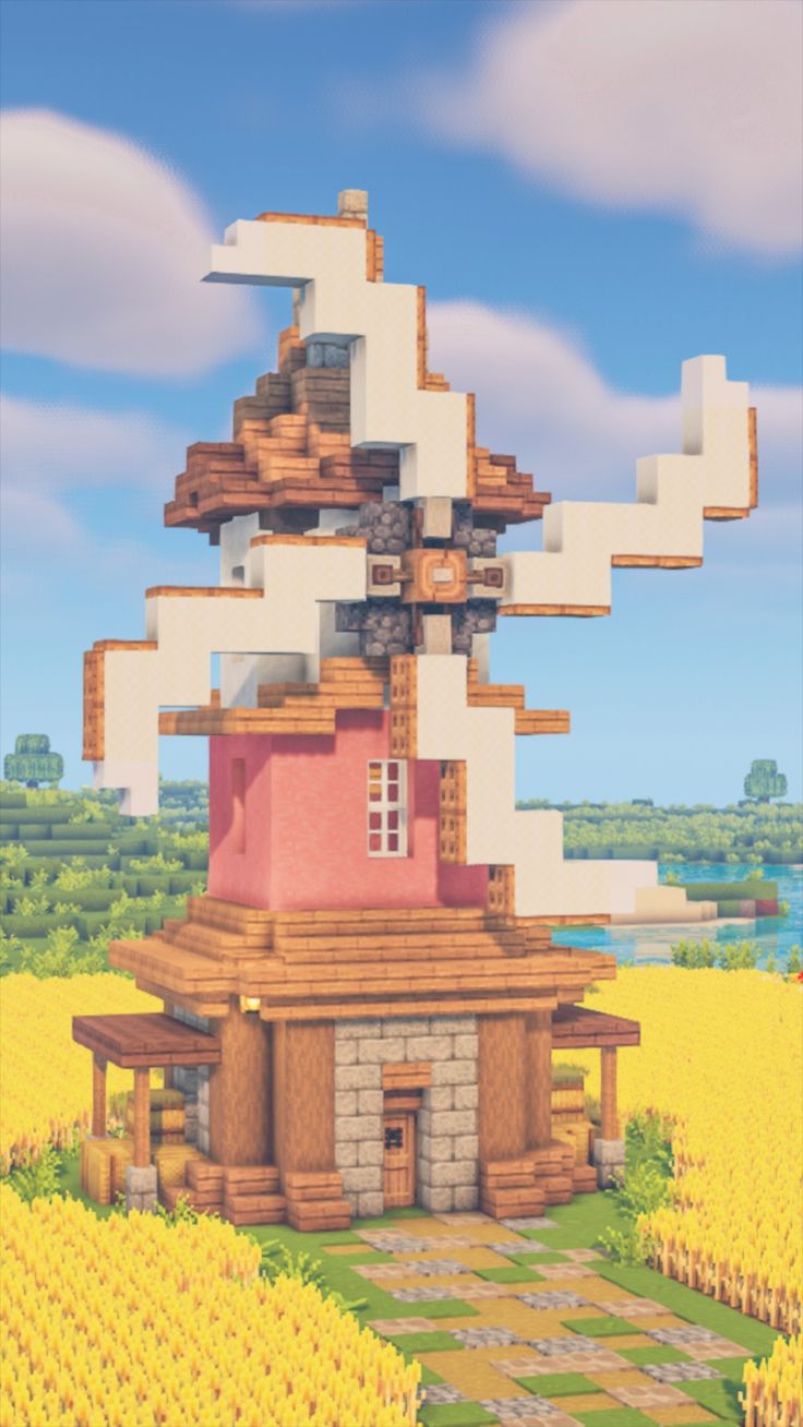
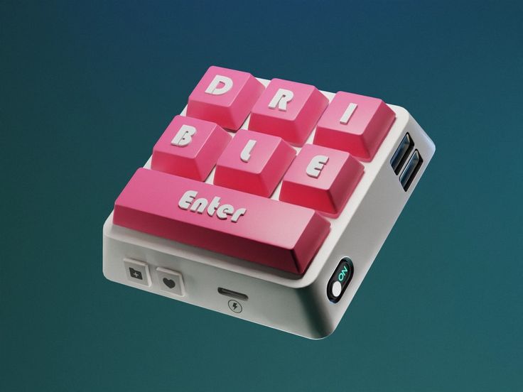
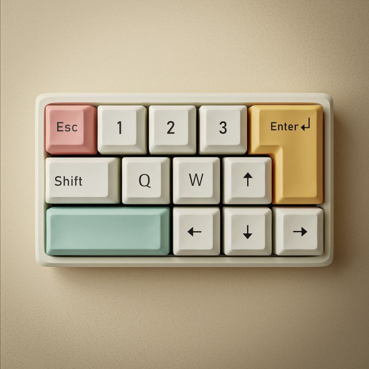
My idea is to use the cube as a 'keyboard' element and make it a button to access all the projects and exercises I have done.
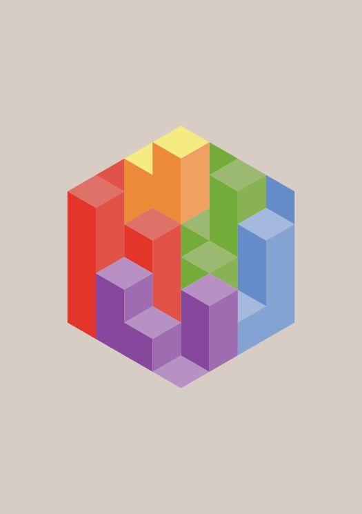
Just like a mechanical keyboard, but without getting into the details of reconstructing the keyboard buttons. I would like to keep the pixelart style and build a tile wall, which will function as a menu and will contain everything.
The question of where info will be stored will be solved through an investigation of how to make a pop-up. In conclusion, the brainstorming phase was me trying to form a concept of a handmade, pixel art layout; and then finding the solution of constructing a 3D wall that will function as buttons.
Part 2: Execution
My first attempt was to make a tile wall with a glow underneath that will look like a shadow. These buttons would be colored according to its content, but the layout was not certain.
Another possibility was to make infos pop from the side when hovered. Although this would be an interesting interaction, it would affect the layout design too much and result in a vertical composition tha relies on scrolling. I wanted a page that goves all the info in the first page and doesn't have any scrolling needed unless there are reading elements. Large texts are suitable for scrolling and diving further, however for other visual based explorations a single page is more effective.
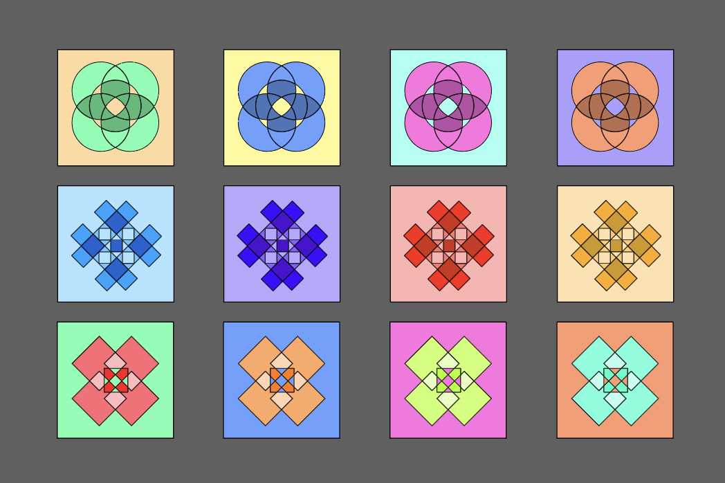
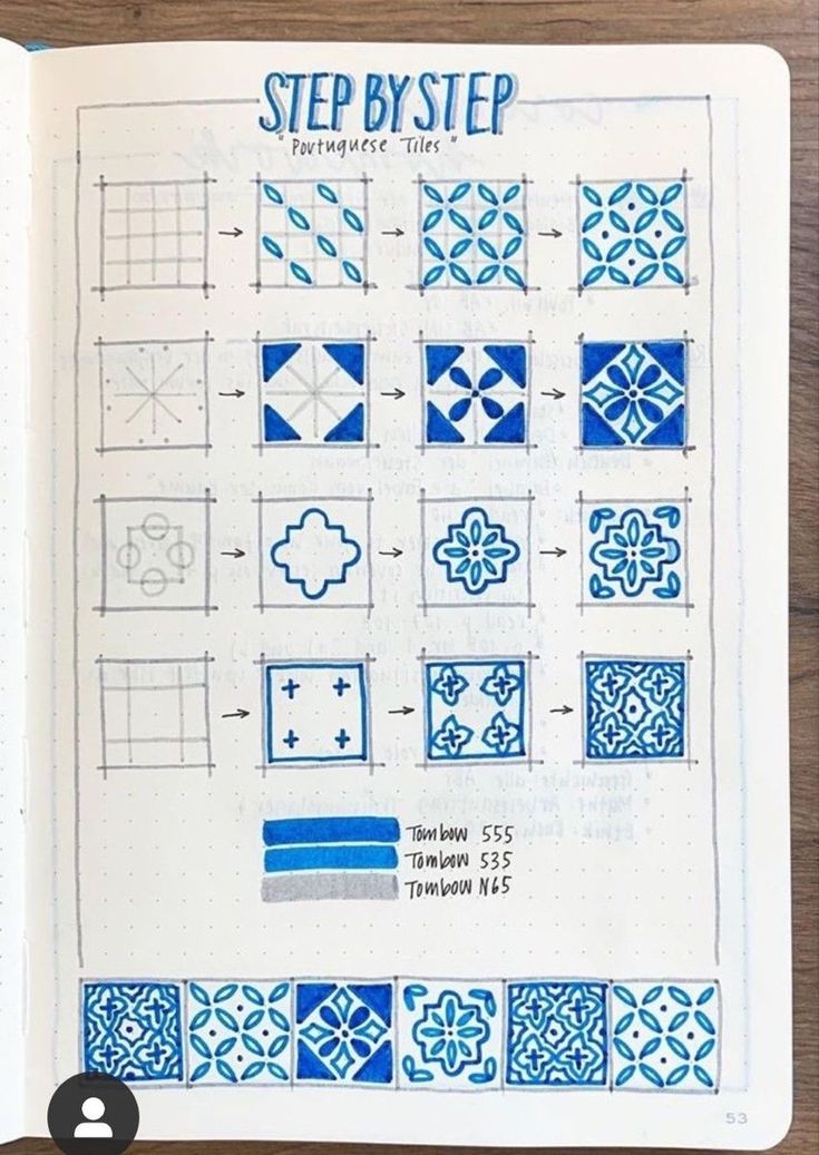
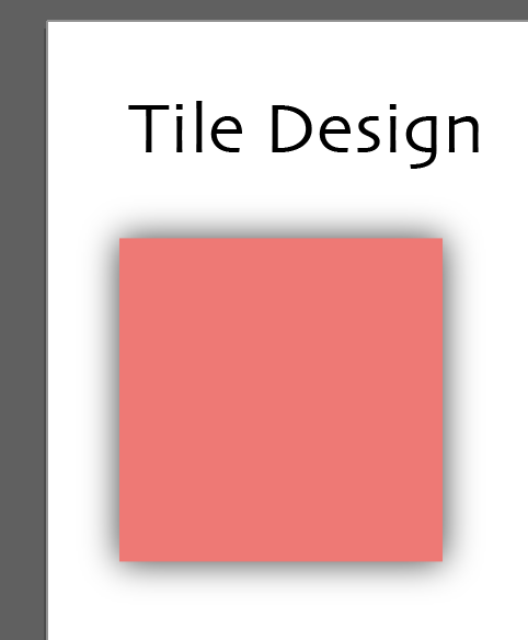
The tile design is influenced by historical tiles. However they're not direct adaptations. I did a free session of playing around with shapes and resulted with a color palette to stick to.
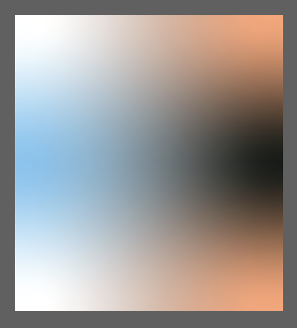
The background could be a more physical environment, however as I experimented with color grading I relaised this would work nice with the sharp edges of squares and cubes. There is a nice contrast in keeping a smooth background.
A serious concern was how to do this website accesible from the phone.
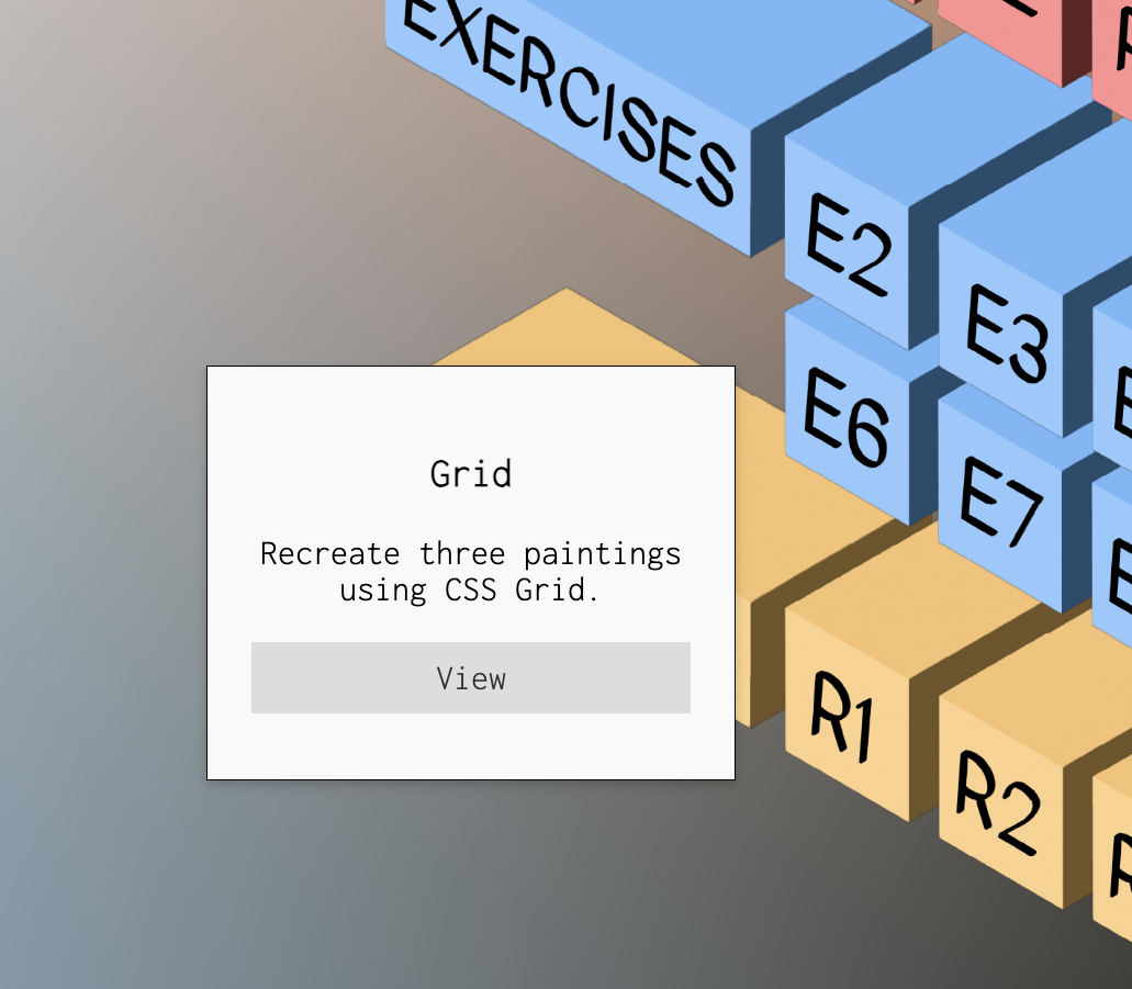
As a solution to presenting links and info, I used JS code for a pop-up that has all the info needed along with small texts that give an idea about the task to a first time viewer.
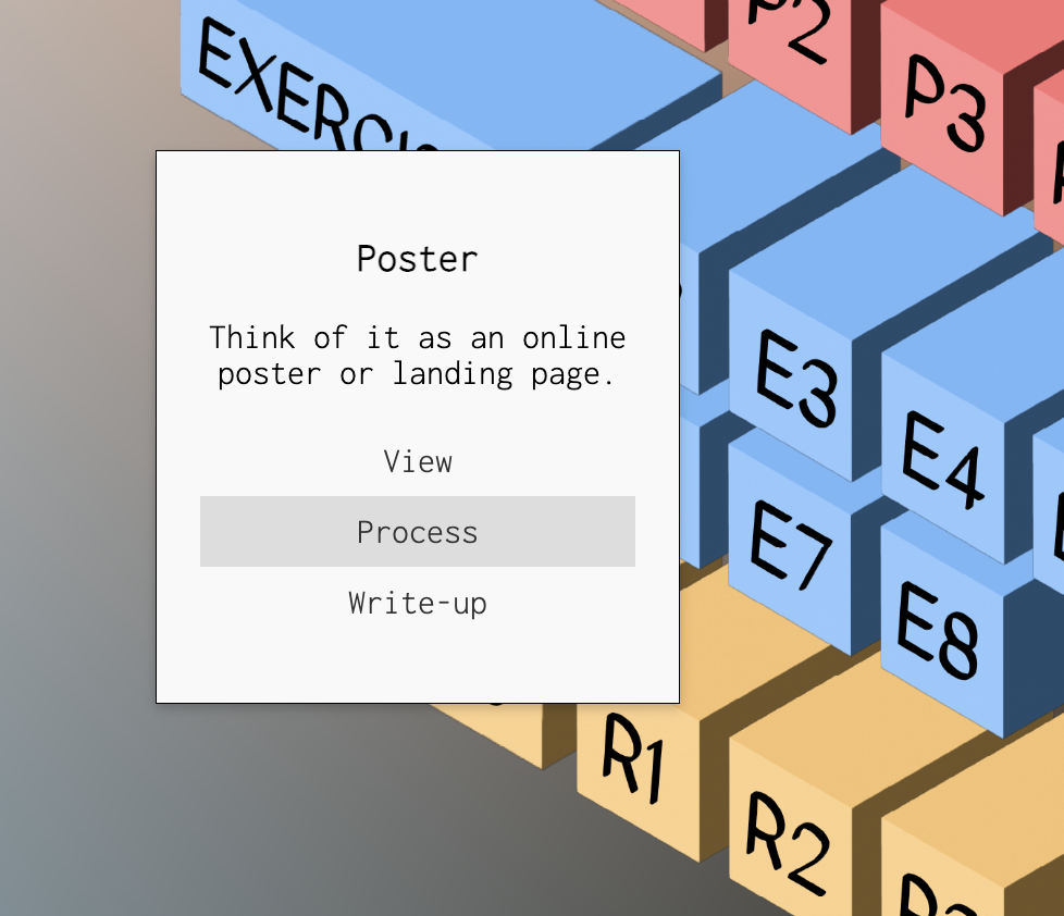
The placing of the pop-up is relative to its parent, which is the button. I also had the buttons line up with eachother and played with their z-index to not overlap each other.
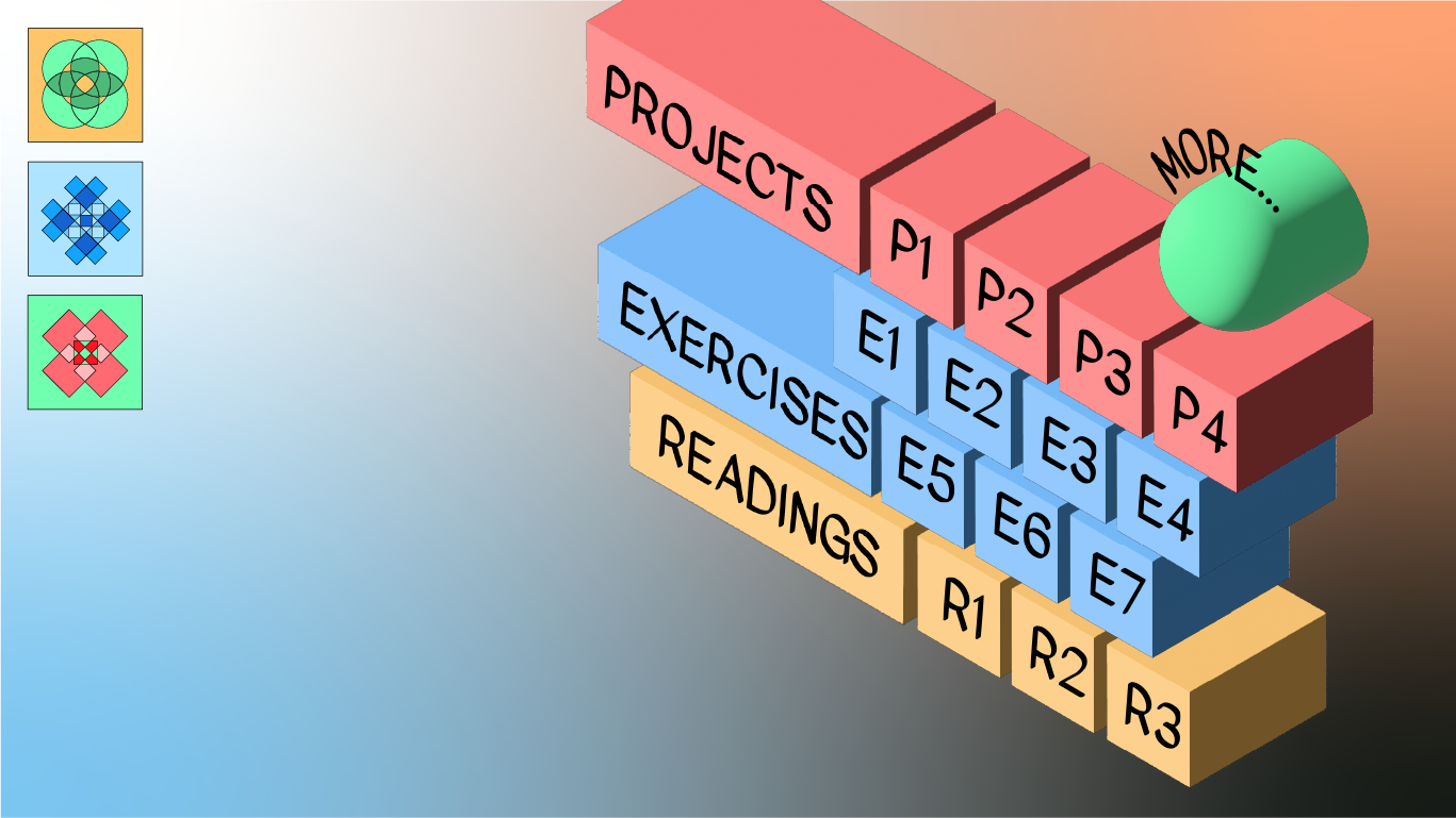
The 'more' button is there to link my other accounts to this page. It also contains a resources page. This button being a spherical one, there is a contrast with all the other buttons which are cubes and very stiff.
Part 3: Final Outcome
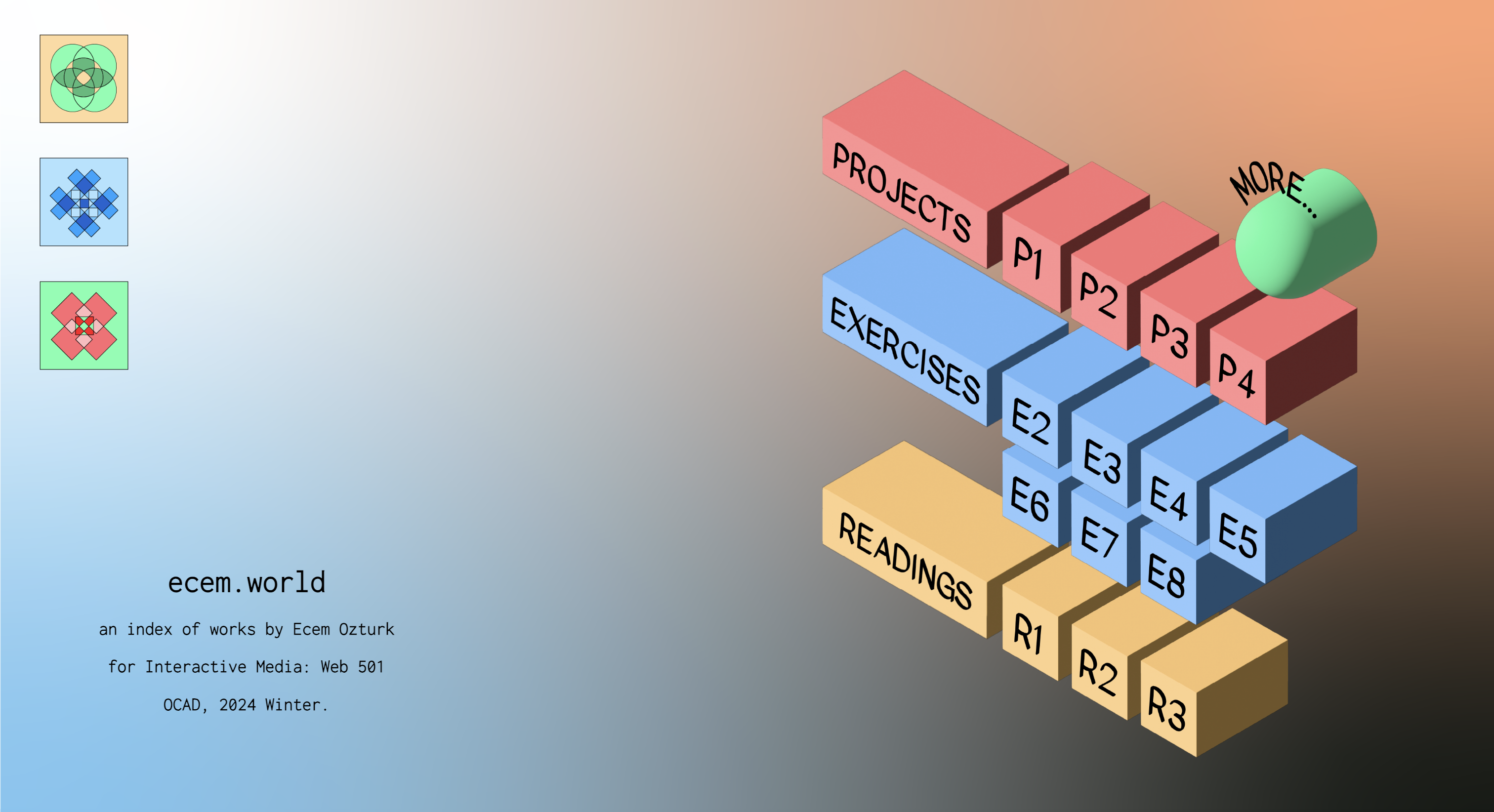
Tiles change color according to the cursor's location. I played around with the triggering ares so that there could also be mix and match between separate color combinations. This is done for only 'play' purposes. It doesn't actually have a function. However, I really wanted have this page to have some kind of a visual interaction, something that the viewer can play with.
Part 4: What's next?
My next steps for a page like this would be to develop a phone version. i would lose the button mechanic and just have a long list of windows that follow each other, and the buttons would be headers for each window. I think the phone is a better place to rely on scrolling as a mode of direction mechanic to explore what the web page offers. I would also add a top menu that contains 'exercises', 'projects' and 'readings' and 'more'.

press to go back to the index!