"Birthday Cake Pixels"
Project 3: Interaction
Process Document
by Ecem Ozturk
Interactive Media:Web 501
OCAD Winter 2024
Part 1: First Approach
When I first started thinking about the interaction that I was assigned -duration (time)- I was suprised. I realised that I have associated interaction with mouse actions. However, this interaction required the user to be in a observer state. Which is also an interaction because the user is then informed about the duration that is passed through the interaction of the content. There has to be a content that is interacting with the time passing.
My approach will be calculating the time passed = a change in the site page. either a content spawning, a content generating (so adding on top of whats existing) or changing. My first attempt was to use the Giphy Api to spawn different gifs. My second approach I used Timezone API to display the Toronto time and perhaps make a page that will react to timezone. However, this would significantly limit the interaction because the content displayed on the page would change very slowly. So I decided to go with calculating the time spent within each session. Not only this gave me the power to establish a new approach to how to calculate time, and establish its own pace within the page's restrictions; it would also giv em the power to determine how dynamic this abstract piece will be.
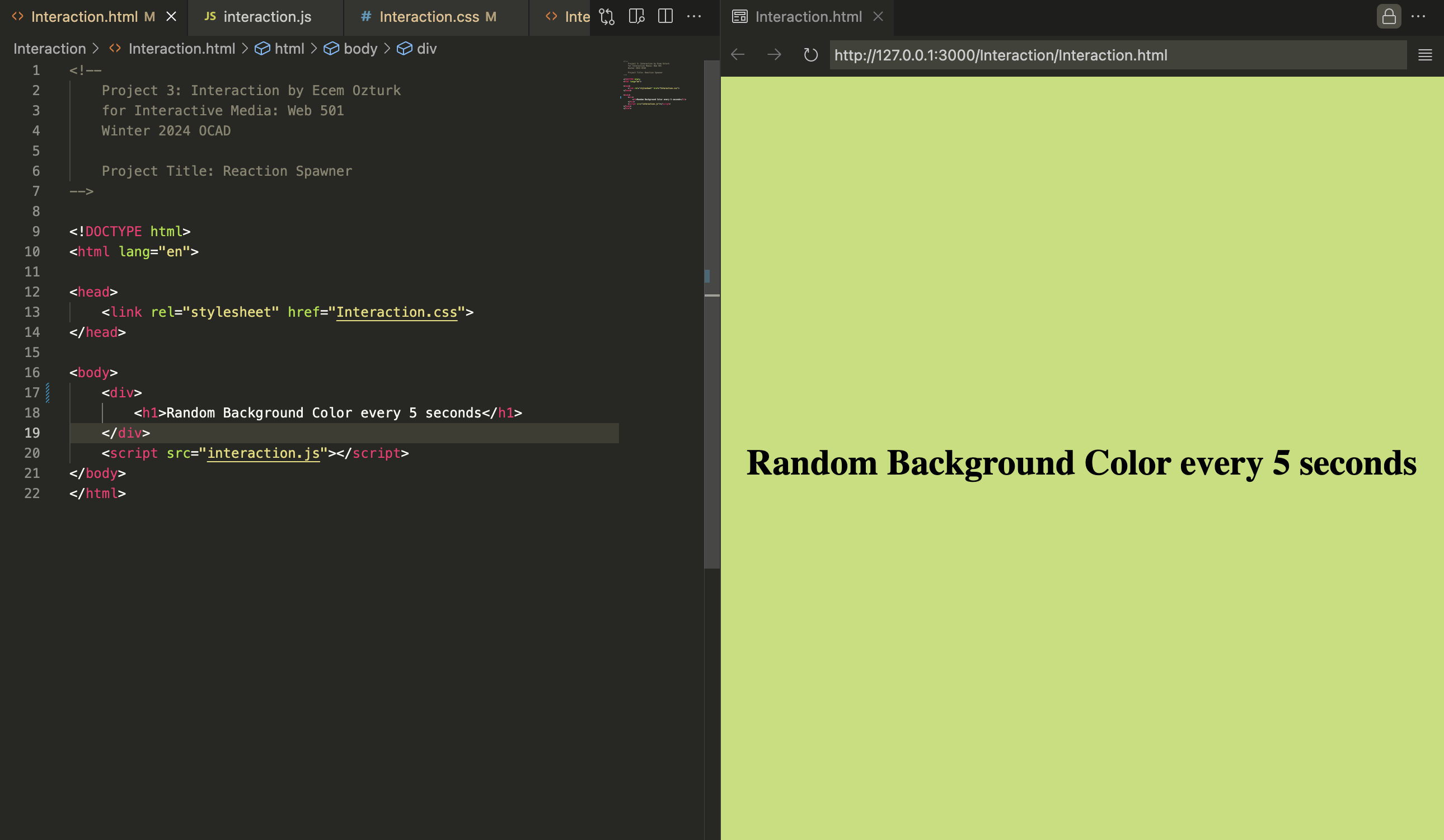
The first sketch I made was a basic code which would randomize the background color every 5 second. This sketch aims to divide the total session to 5 seconds slices. However this doesn't record the amount of time passed. Which is an essential element to craft this as a true "time" triggered piece. The viewer must know how much time has passed. This is still a relevant exercise to understand how the code worked.
Part 2: How do we measure time?
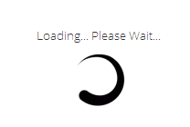
In the digital world, there are plenty of ways to experience time passing. Mostly it has something to do with downloading of content before we interact with something. Sometimes this is named as "wait loader" and is designed by UI designers along with other UI assets. These designs add onto our experience of apps/websites. Sometimes this duration is made functional by putting text/visuals there. Most of the times, the user is alone with a gif, resembling time passing as content is downloading.
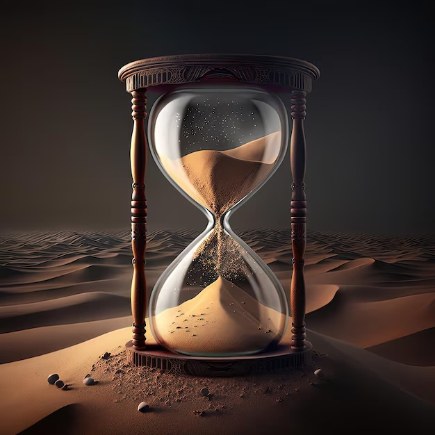
Another visual way to "see" time passing is the physical object of a hourglass/sand watch. Just like waiting loaders in the digital world, or just like how our batteries on our Iphones load up, the metaphor of hourglass is very tempting to play around with. Pixels, in this sense could be the metaphoric sand particles. Rperesentation of passing time will be my concept for this project.
Part 3: Relevant Project Examples and Tutorials
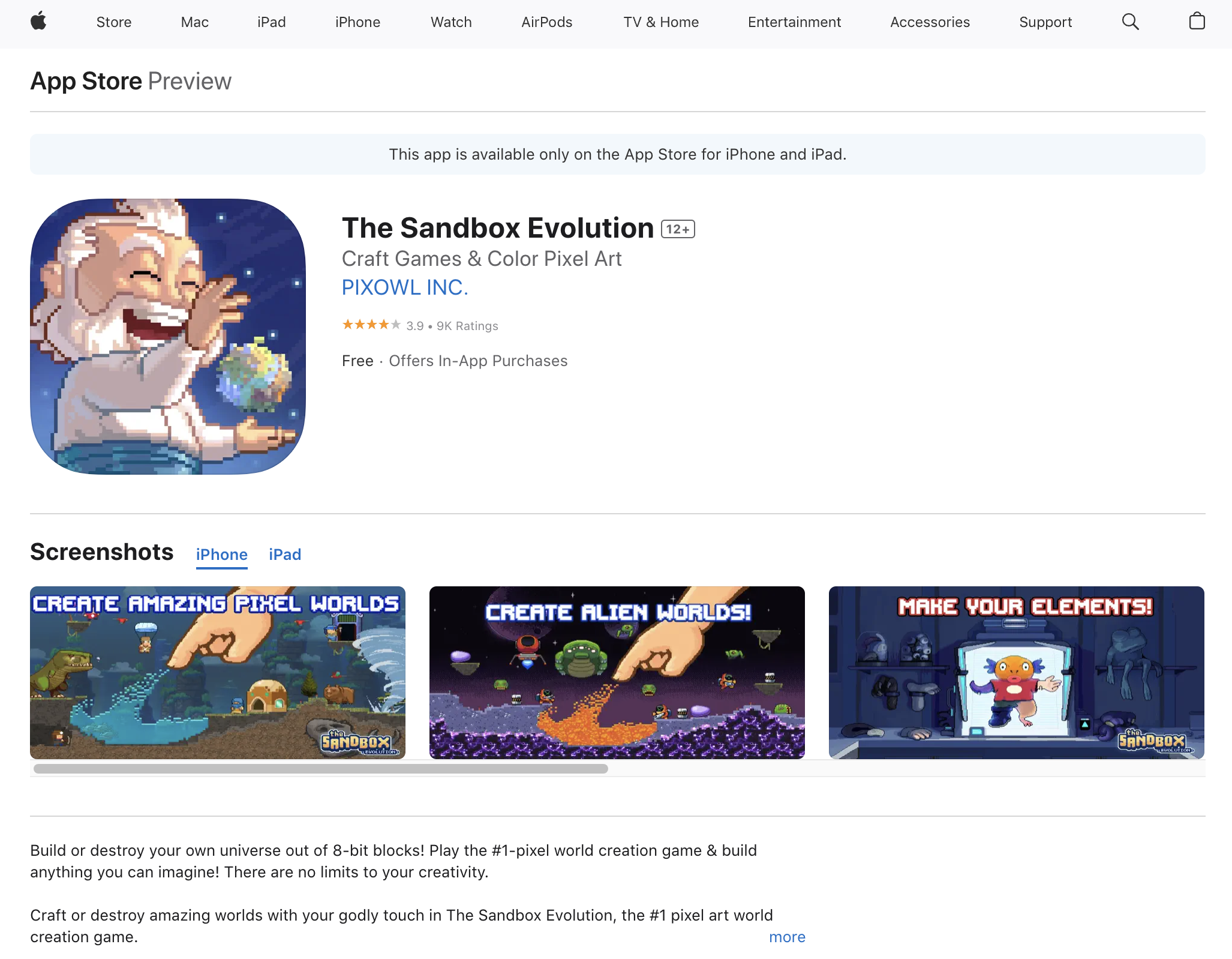
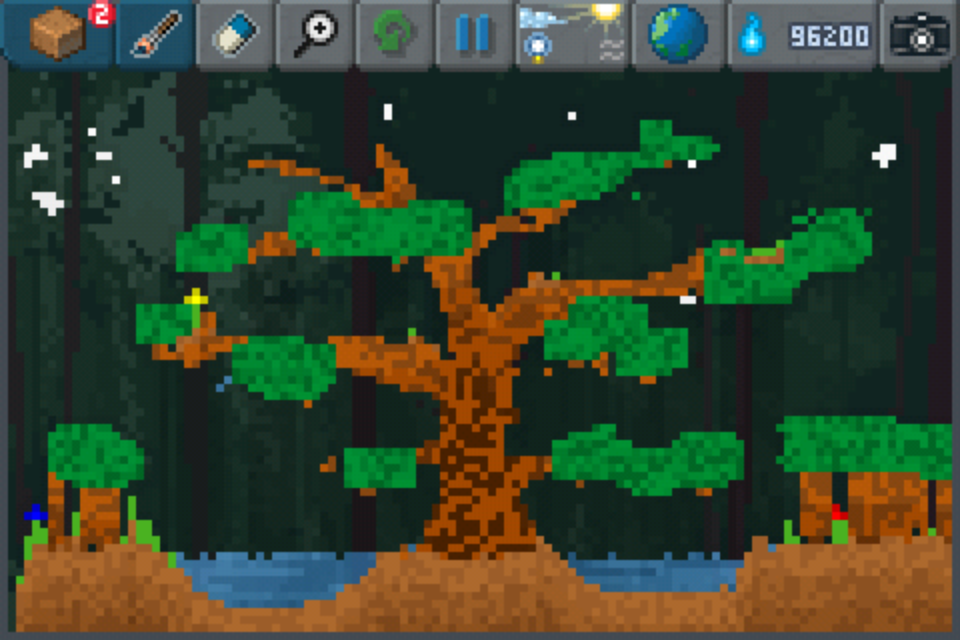
Sandbox was a game I played a lot when I was a kid. It was one o fthe first apps I downloaded to my ipad. You played the god and created habitats and reached goals by doing so. Tapping would trigger the elements appearing on the pixel display. This game was full with pixel art since it was the primary medium of visuals. The moment I decided to go with pixel as the smallest shape, this game came to my mind. Because sand was the initial element you played with. I remember sand pixels falling as I tapped.
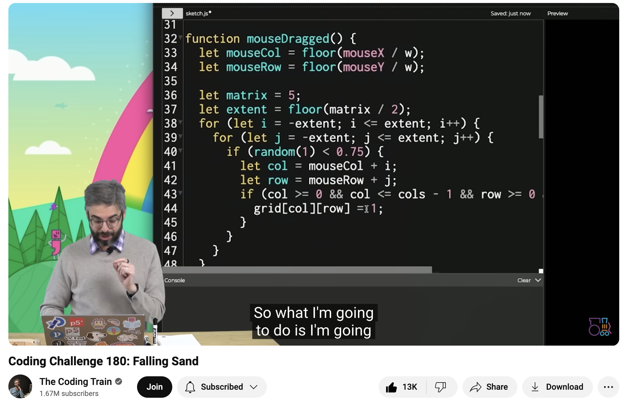
The Coding Train is a great source to learn P5.JS. As I did a quick search, I saw that my pixel watch could be made possible easily using P5.Js. This was the tutorial I found. It was very easy to follow and I was able to follow it. The only difference is that this tutorial aims to make a click-triggered sandbox game. I changed it to randomly spawn from the top of the window. Just like as if someone was pouring down sand. Or as if it was raining.
Next up: 3 very nice web based examples of sandbox games.
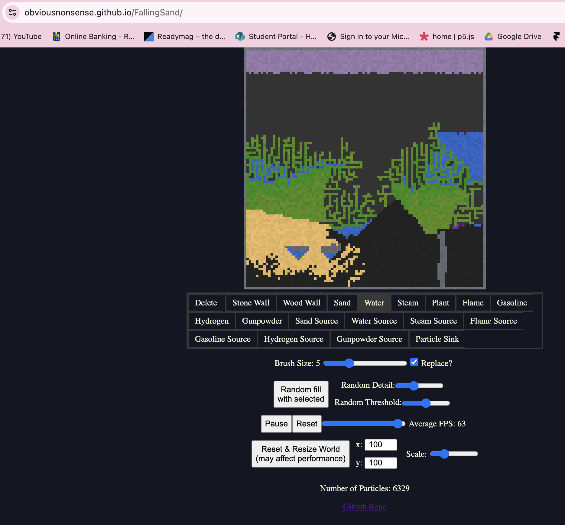
Obvious Nonsense has an open source code available on github. The mechanic is exactly the same with Sandbox mobile game. I am not making a click-triggered mechanic, however this example helped me because I was able to check the script, and also I was interested in different elements and their different mechanics and the way they effected each other.
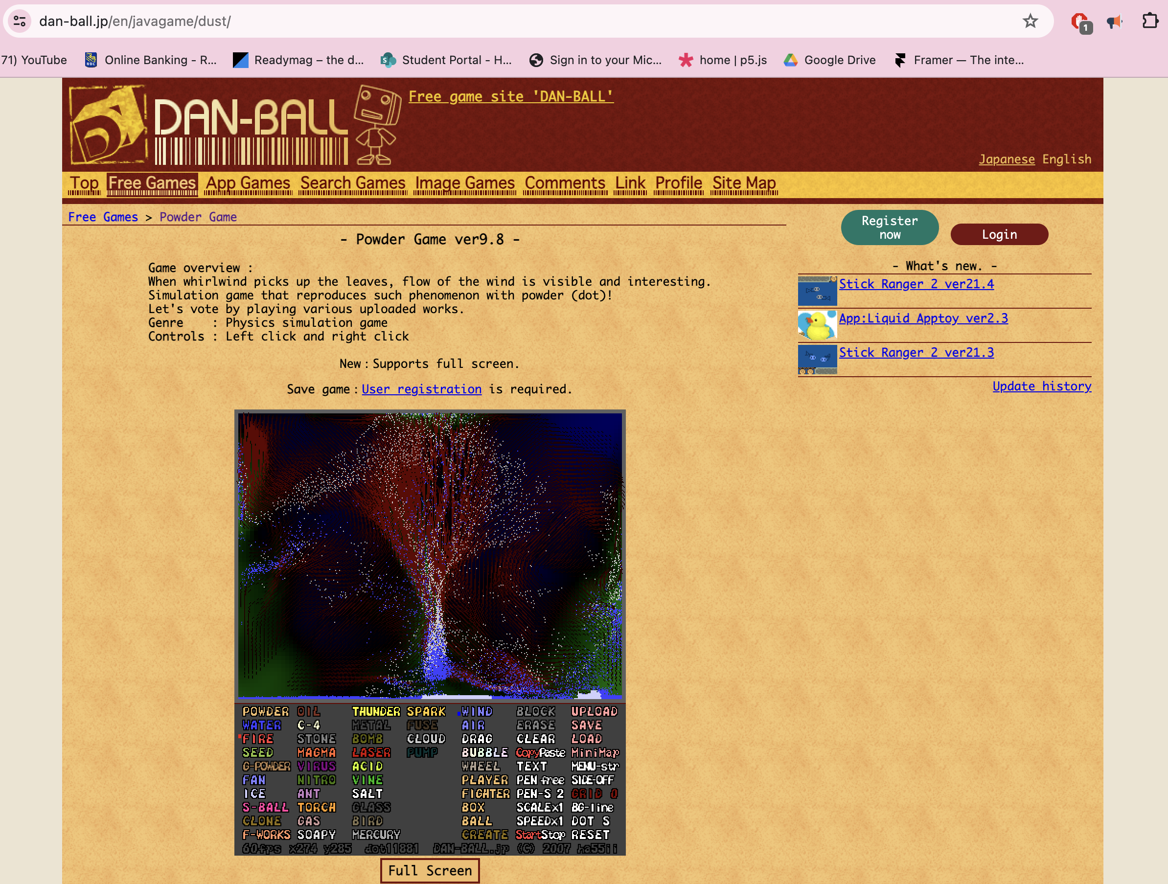
This game was referenced by our next example: Sandspiel. But I wanted to include it before I get into that because this is an older example. The pixel mechanic of this example is very sophisticated. Some elements were able to fly and change directions fastly. The user can also send some laser beams and wind, which makes the interaction very fun and high paced.
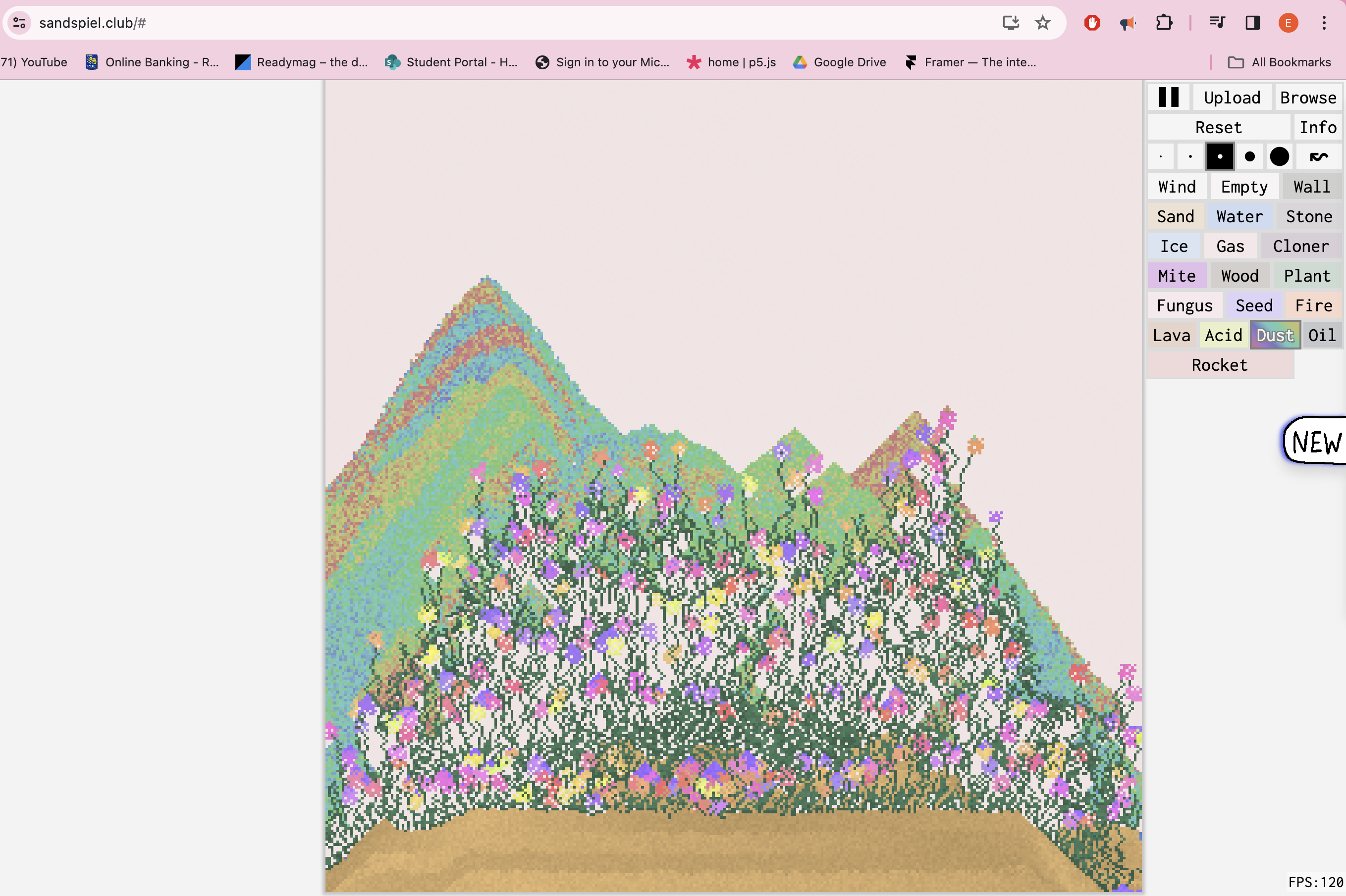
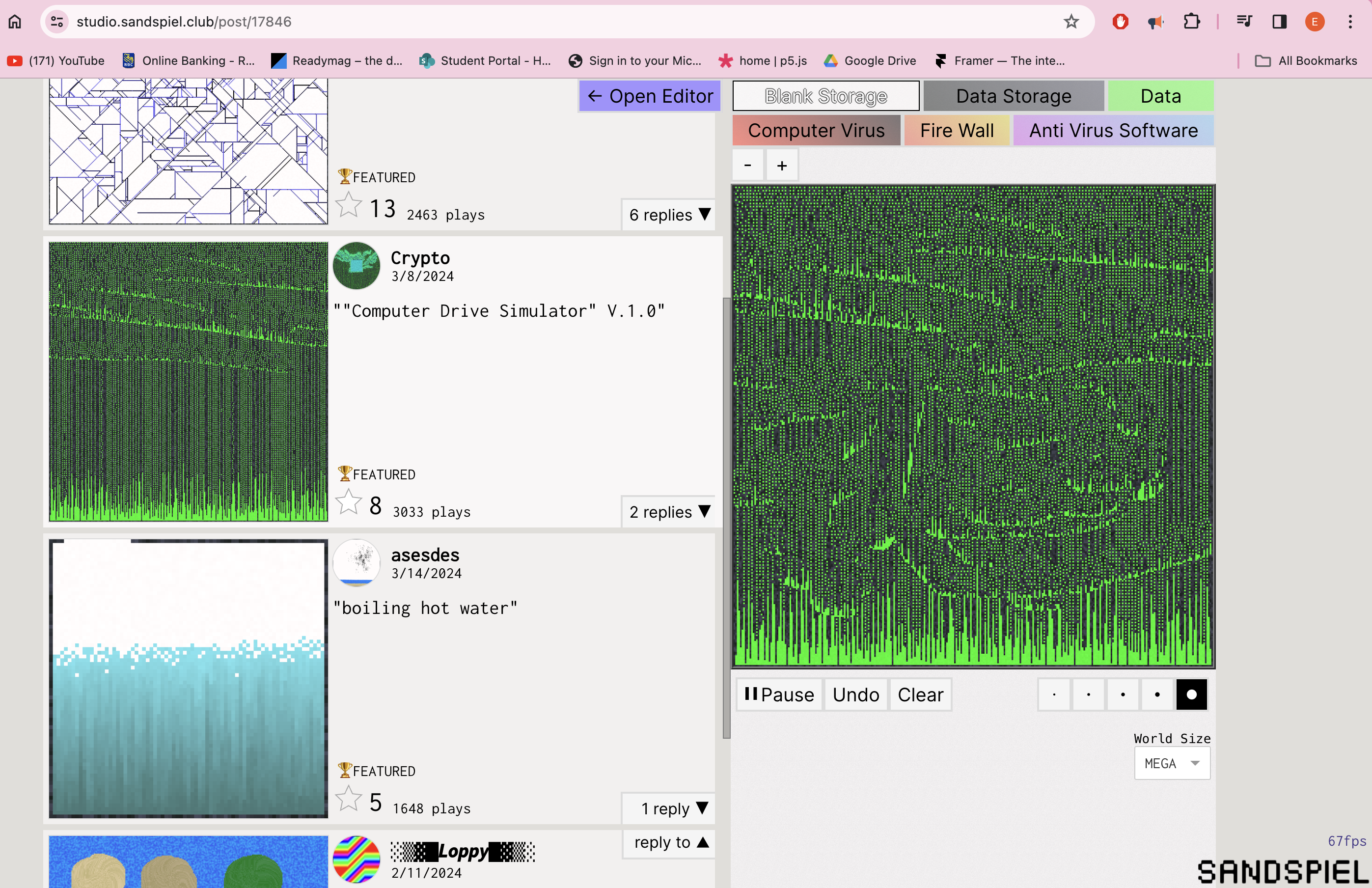
This is by far the best example I have came across. The team behind it is also working on a "studio" version in which the user can code individual versions, using a "Scratch" like node based coding language, easily and share there to be tried by many others. People have experimented with this tool a lot. The one I display here is a "Matrix" themed one. There is also sound component succesfully incorprated with each example.
Part : Process
I used The Coding Train's tutorial to set up the pixel working mechanic.
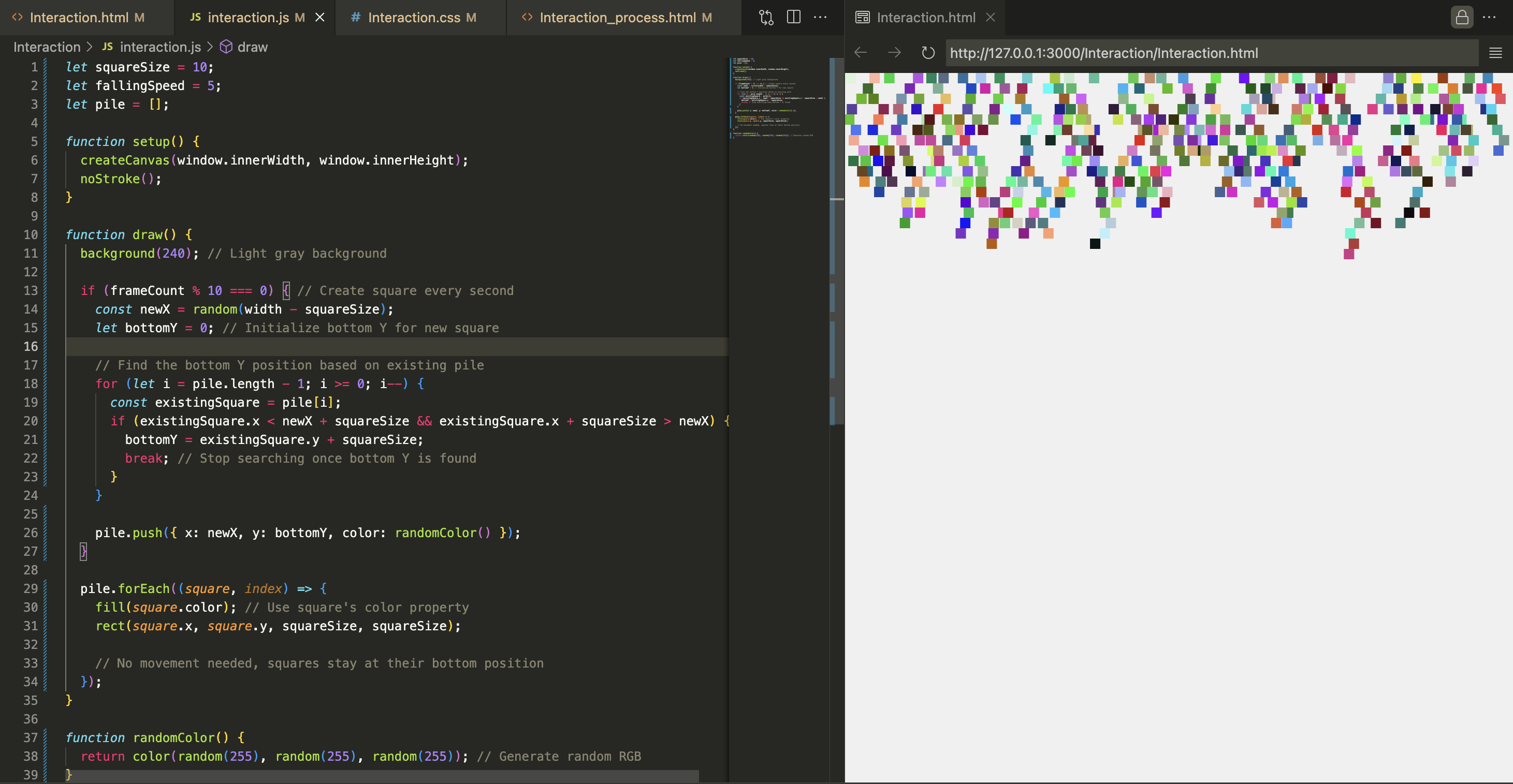
Some many errors using ChatGPT and Gemini later, I arrived at this upside down and random color version.
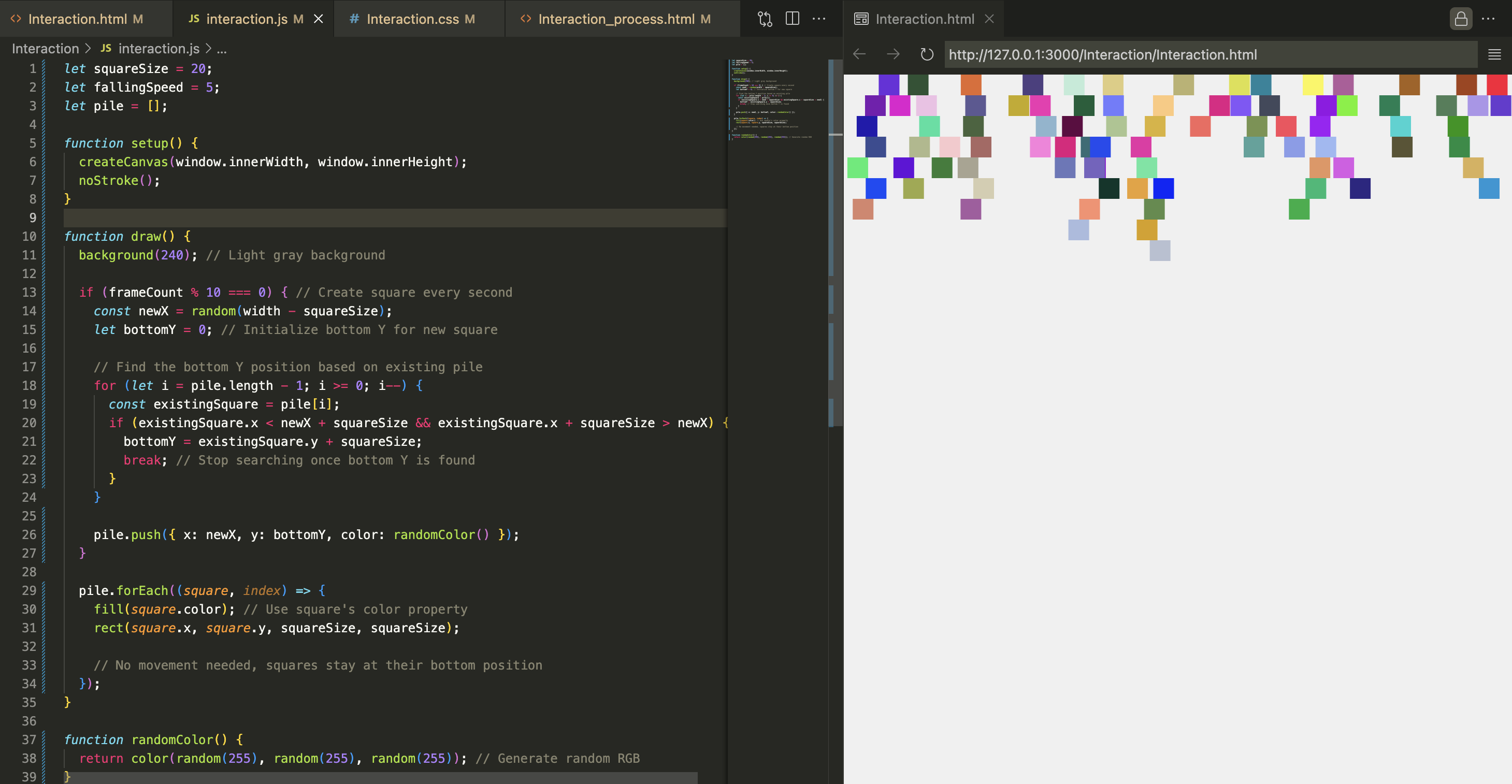
The pixels in this example generate, not fall. Although I really like this generation movement too, I decided to focus on the falling mechanism.
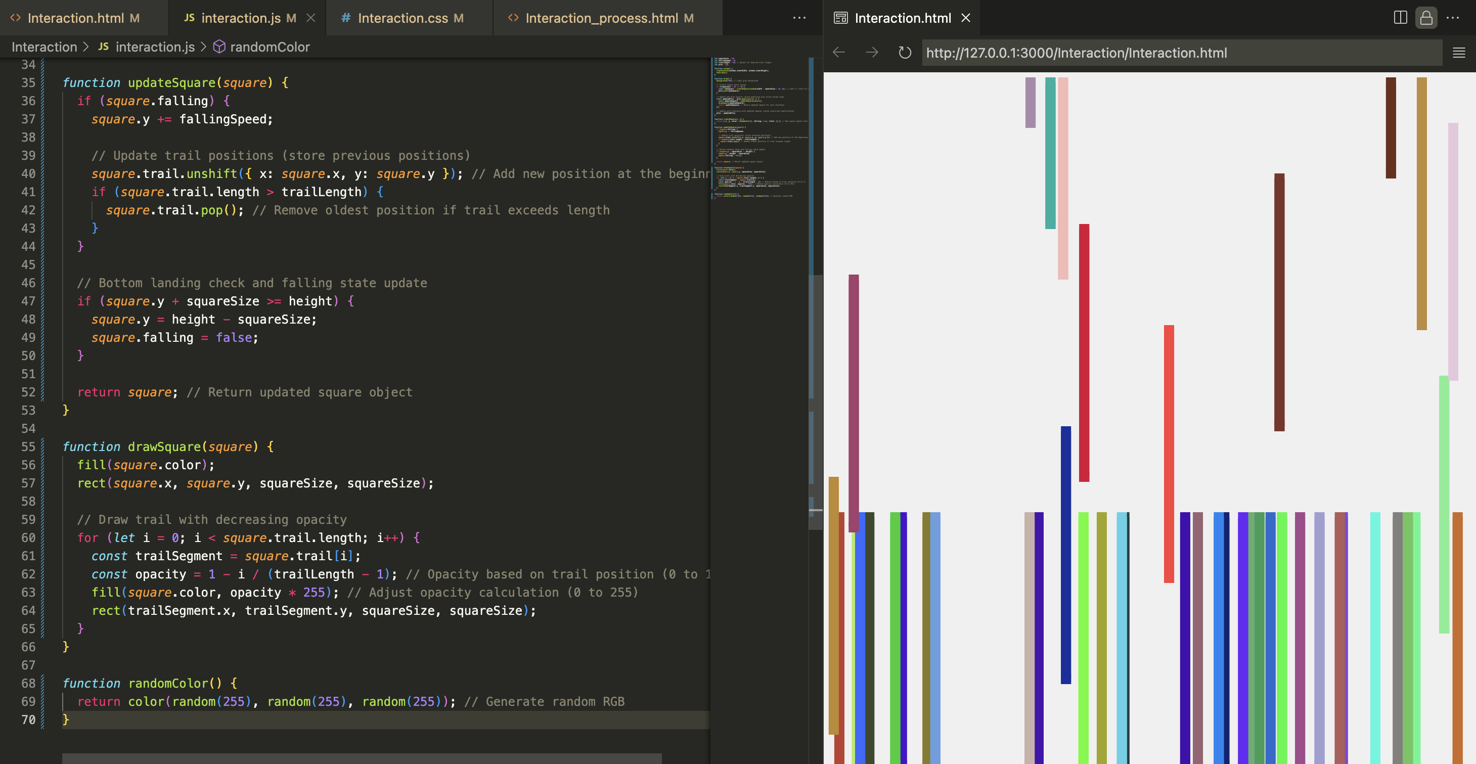
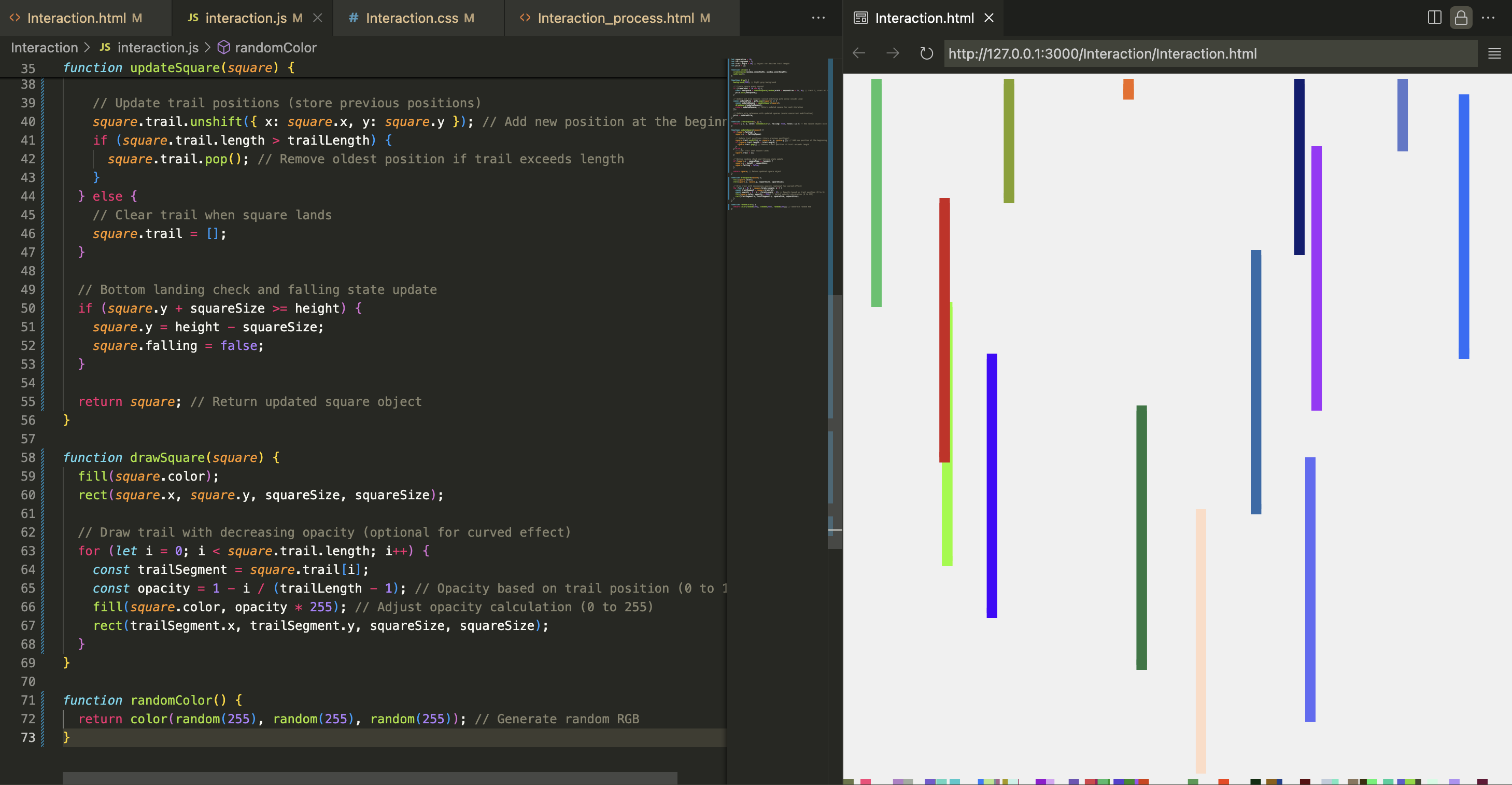
I tried to make a trail along the pixel for some time, however I failed. This is something I would like to learn for further practice.
Black and white version also was very appealing to my taste. However, I would want to incorprate one more mechanic for it to work. As it is, it felt a bit too direct. This is why I wanted to exercise colors and the mechanic of randomness next to form a concept.
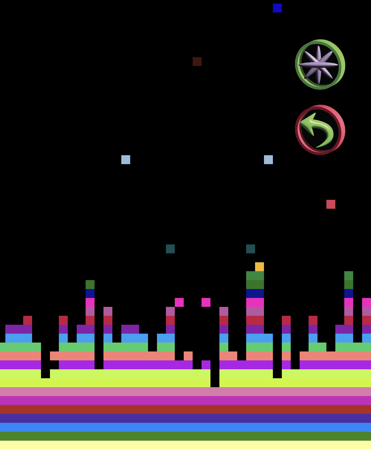
I wanted to treat the rows as layers and make pixels color according to the row they fall in. So first I got rid of the checkered pattern and focused on the rows.This way it was easier for the user to understand the pixels are being a part of a bigger piece of the whole. However I didn't want to predetermine any color scheme. Instead, I made it randomize with each refresh. The concept has became colorful layer by layer, just like a birthday cake. So the amount of time the user waits on this page, will show them a unique birthday cake that is chosen by the randomness of the code.
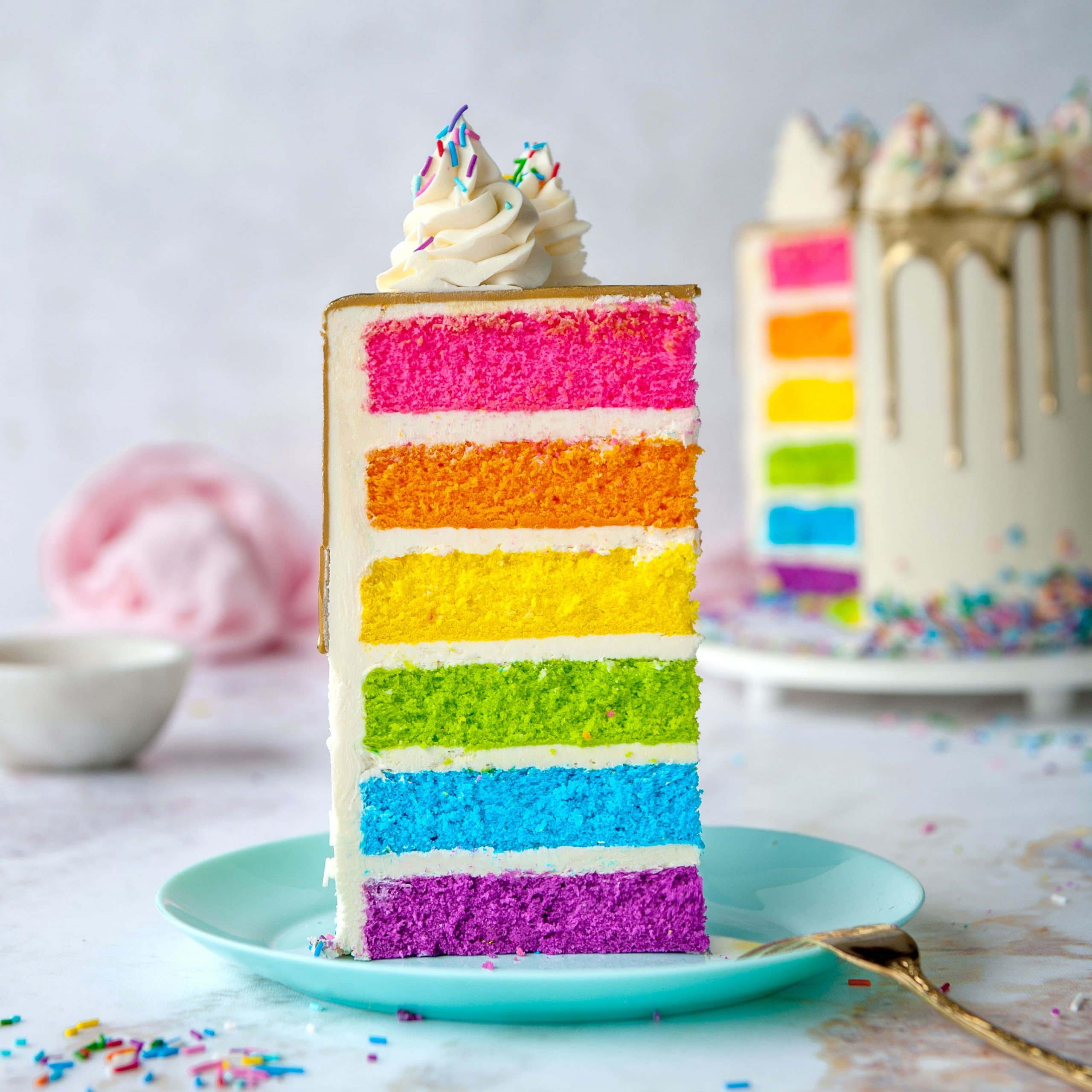
Which is very metaphorical and interesting because birthdays themselves are a tool to measure time. Therefore, birthday cakes are what we use to visualise a year passing. This website could be a widget, that could be put on the desktop, and each day a pixel would light up, and on your borthday the cake would be completed; it would be very cool. Maybe I'll do it as a small project :)
I decided to go with black background to make the colors pop.


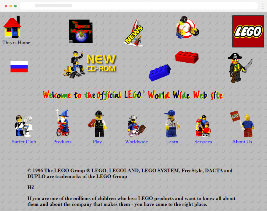
The need to include buttons arised when the coloring part became a thing. Randomization of colors means some users might need to refresh to find a combination they liked. I decided to design the buttons myself using Illustrator's 3D capabilities. I went with a rather retro trend of making 3D logos. I wanted to somehow keep the handmade/90s aesthetic in this page.

press to go back to the index!